Client: The Home Depot
Role: UX Designer & UX Researcher
Tools: Figma, Jira, Confluence, Miro, Baymard, dscout
Overview
When shopping online for high-consideration items like appliances or home décor, customers often rely on rich visual content to feel confident in their purchase. At The Home Depot, we heard consistently in user interviews that our Product Detail Page (PDP) media gallery wasn’t meeting those expectations—on mobile and desktop. Customers wanted to examine fabrics up close, explore features from all angles, and engage with videos, 360° views, or even augmented reality. But the existing gallery was cluttered, outdated, and didn’t support that level of exploration.
This case study walks through how I as the UX Designer, along with my cross-functional team members, identified key usability gaps and reimagined the PDP media gallery to support a more modern, visual-first shopping experience—one that better mimics the in-store “touch-and-feel” experience and gives customers the confidence to click “Add to Cart.”
How might we…
Design a flexible, intuitive media gallery that empowers customers to explore product content in their preferred way—boosting confidence in their purchasing decision while driving higher conversion rates and customer satisfaction?
Discovery
Before diving into design solutions, our balanced team—comprised of product, engineering, and UX—set out to better understand the current state of the media gallery experience and the needs of our users. Through a combination of UX audits, competitive research, and user interviews, I uncovered several key insights that shaped the direction of our work.
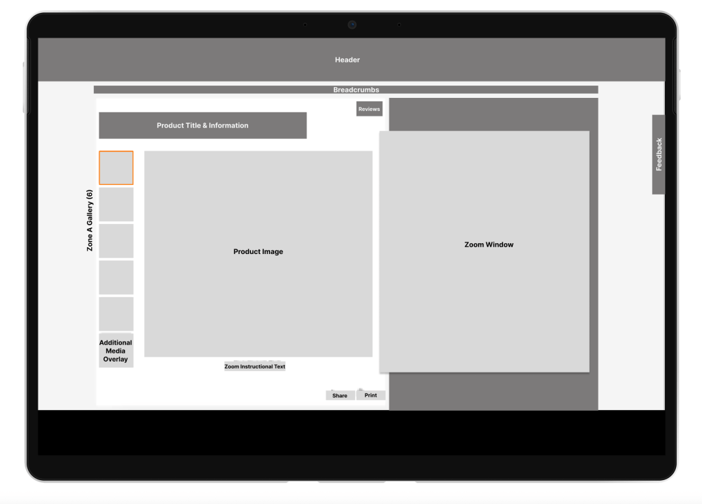
Audit of the Current Experience
I first conducted a full content audit & inventory of the existing media gallery components and interactions across our desktop, mobile web, and app experiences.
Key Findings
The media gallery was huge, complex and inconsistent, consisting of:
- 40+ components on desktop
- 30+ components on mobile web
- 8 types of media (images, videos, 360° views, AR, etc.)
- 4 distinct gallery “zones” with varying behavior
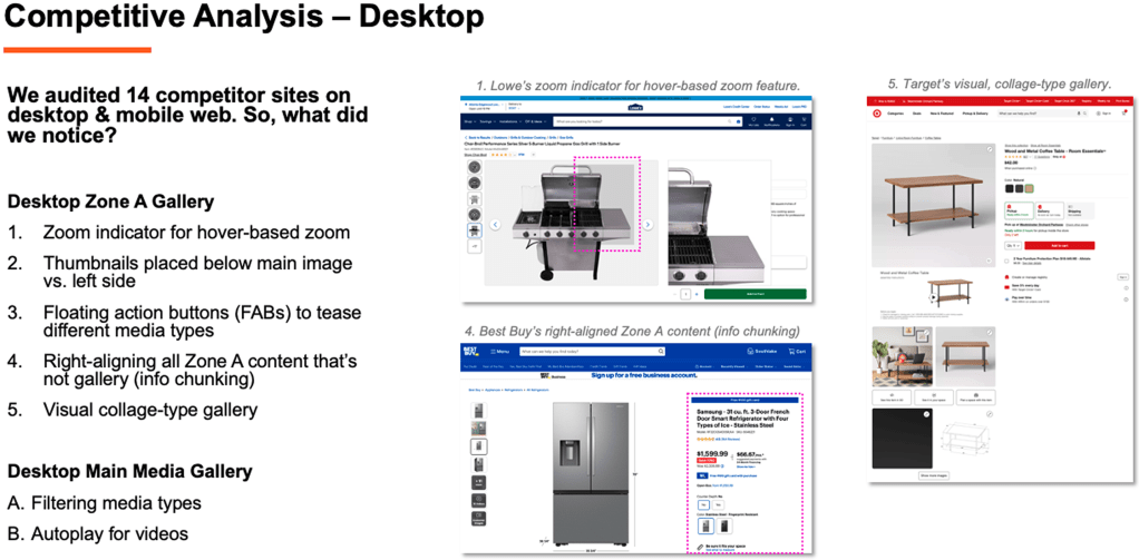
Competitive Analysis
I audited 14 competitor sites across desktop, mobile web, and app to benchmark media gallery experiences.
Moderated User Interviews
To better understand how customers were engaging with the media gallery, I partnered with our UX Research team to conduct 10 moderated user interviews. Participants explored PDPs for three different product types—a hammer (low consideration), a refrigerator (high consideration), and a couch (visual, tactile).
Research Goals
- Learn how users navigate and consume media
- Identify what types of media they expect to see
- Understand how media supports decision-making
Key Research Insights
- Media use is highly personalized: Some users prefer images first, others gravitate toward video or 360° views.
- High-consideration = higher media expectations: Shoppers evaluating big-ticket or visually-driven items expect more detailed media.
- Low-consideration = fast decisions: These users often ignore media beyond the first few images.
Users Needs/Expectations
- Larger product images
- Fewer clicks/taps to play videos (especially on mobile)
- Clear gallery navigation indicators
- High-resolution, zoomable visuals
Key Discovery Takeaways
The biggest insight from discovery was that the Media Gallery is a deeply personal experience. Customers’ media preferences vary based on product type, personal shopping style, and the level of financial investment. Some shoppers rely on videos and 360° views to understand key product features, while others only need a few high-quality images to feel confident in their purchase.
One major issue with the existing experience was that alternate media types weren’t clearly surfaced—many users didn’t even realize they were available. That insight led to a clear design goal: create a gallery that’s simple, intuitive, and flexible—one that supports a “choose-your-own-adventure” approach, allowing each customer to explore the media they find most valuable.
Time for Design
After nearly a quarter’s worth of UX discovery and a clear understanding of user needs, it was time to move into ideation and prototyping. My UX partner and I explored two rounds of design iterations:
- Round 1: Concepts built within Stencil, The Home Depot’s in-house design system
- Round 2: Blue-sky exploration that pushed the boundaries of the design system to imagine more innovative, visually immersive solutions
Across both rounds, we developed 16 desktop and 8 mobile concepts—starting with low-fidelity wireframes to quickly visualize and compare ideas.
Design Themes & Exploration
Through our iterations, several design themes emerged that directly addressed key user pain points:
Visual Optimization: We experimented with replacing standard fixed-size thumbnails with larger product images and Floating Action Buttons (FABs) that preview different media types. This upfront visibility helped users understand what types of content were available from the start.
Efficient Navigation: We explored multiple navigation models, from hover-based image transitions to carousels and sliders. The goal was to make it easier for users to move through content quickly without feeling overwhelmed.
Content Discovery: With some products offering up to eight different media types, we tested ways to segment or group content—making it easier for users to find the type of media that best supports their decision-making (e.g., video, 360° view, AR).
Enhanced Video Experience: Instead of static thumbnails, we explored using interactive video previews and a media queue system, allowing users to easily preview and play content without disrupting their browsing flow.
User Interaction Spectrum: We tested a range of experiences—from minimal, focused image displays to richer, more collage-style layouts that surfaced multiple media types at once. This allowed us to gauge how much interactivity and visual complexity users were comfortable with.
 Elizabeth Driver